Is a picture worth a thousand words?
Q&A with Anna Walker Skillman & Barbara Westbrook
Interview by Elizabeth Hanson • Title Photo by Philip Grossman
Let’s start with a doozy: Why do you love photography?
AWS: This is a good question. My love for photography seems to have happened organically. My earliest influence of fine art was from my grandmother who studied at Parsons in NY in the late 30’s and was a portrait artist in the south. Art was in my DNA, whether I realized it or not. I studied art history which is simply a study of images and stories of artists and architecture. It was not until I saw Helen Levitt’s retrospective at the SF Museum of Modern Art in 1991 that I fell in love with the medium. This exhibition opened my eyes to the complexity of photography expressed both by her intimacy and understanding of place, and her raw observations of daily life explored in streets of New York City in the 40’s and 50’s. To this day, Levitt remains a favorite of mine.

Helen Levitt, New York (TWO CHILDREN DANCING, CIRCA 1940. CoPYRIGHT OF THE ARTIST.
BW: I love how it is a completely versatile medium. A traditional photograph can look quite striking in a modern space and a more modern image can blend seamlessly and surprisingly into a more traditional room. And nothing can freshen a staid interior like a fabulous photograph.

Kimerlee Curyl, (left) Together We Stand and (right) Unicorn, courtesy of the artist and Exhibit by Aberson.
Barbara, as a designer, what do you look for in photographs when researching pieces to show to a client?
BW: Like with any art, you should just love it. I typically prefer not-too-edgy subjects like nature, landscapes, old barns, architecture, horses, etc. and will filter options through the room’s color palette to see what fits best. Art is usually a more personal decision for a client than a sofa, so it’s often a collaboration of ideas when we’re deciding on what works best.
LYNN GEESAMAN, TRIO OF FRAMED PHOTOGRAPHS.
Anna, as a gallerist, how do you work with designers and their clients to help them curate collections that will stand the test of time?
AWS: I really love working with designers. I admire a great deal their talent in putting together a space. I am always in awe of both architects and designers, and how they transform spaces. First of all, I like to understand the inspiration of the space, in addition to the client’s style. I ask many questions about the client, as well as, which artwork will connect with their space. I find the designer, after the space is complete, really is his or her own artist of the space. I love that collaboration. We have a new Jackson Fine Art app that is super helpful in viewing photography in the space and getting a feel of what will work. Seeing the artwork is one thing, but then virtually installing it in the space with a frame (black, white, silver, natural wood, etc.) really does transform the artwork. The images have to be selected first, and then the presentation is sometimes just as important for the space.
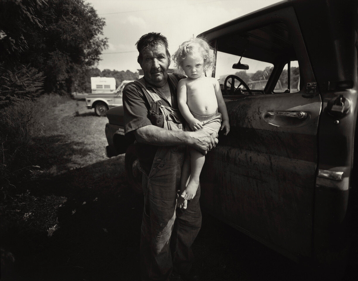
JACK SPENCER, WEST TEXAS ROAD, 2004, SOVEREIGN BUCKHEAD. COPYRIGHT OF THE ARTIST AND COURTESY OF JACKSON FINE ART.
Are there right and wrong ways to frame photographs?
AWS: This is a good question. Most artists determine the presentation of how they want the work to be seen. This involves the production, making the print, deciding with or without borders, whether it is matted or floating, mounted or not mounted. There are many decisions to be made. The type of frame can completely change the way it appears. It is super important to understand how the artist prefers the work to be presented, and if there is flexibility. You can always work with the gallery or a designer to decide what is the best way to present the artwork in your space. And yes, there is a right and wrong way to frame work. There are nuances to every photograph to ensure the stewardship and conversation of the work. Photography is paper, and it has to be framed professionally with care for protection against the natural elements.

ANDREW MOORE, LIBRARY, GAINSWOOD, DEMOPOLIS, ALABAMA, 2017.
BW: Absolutely. Framing can often cost more than the actual photograph and should always suit the piece first. And for photography specifically, I usually like a simpler, more modern frame style and not something heavy-handed. Let the subject speak and not the frame. Heavy frames can date any piece of artwork quickly, but especially a photograph.
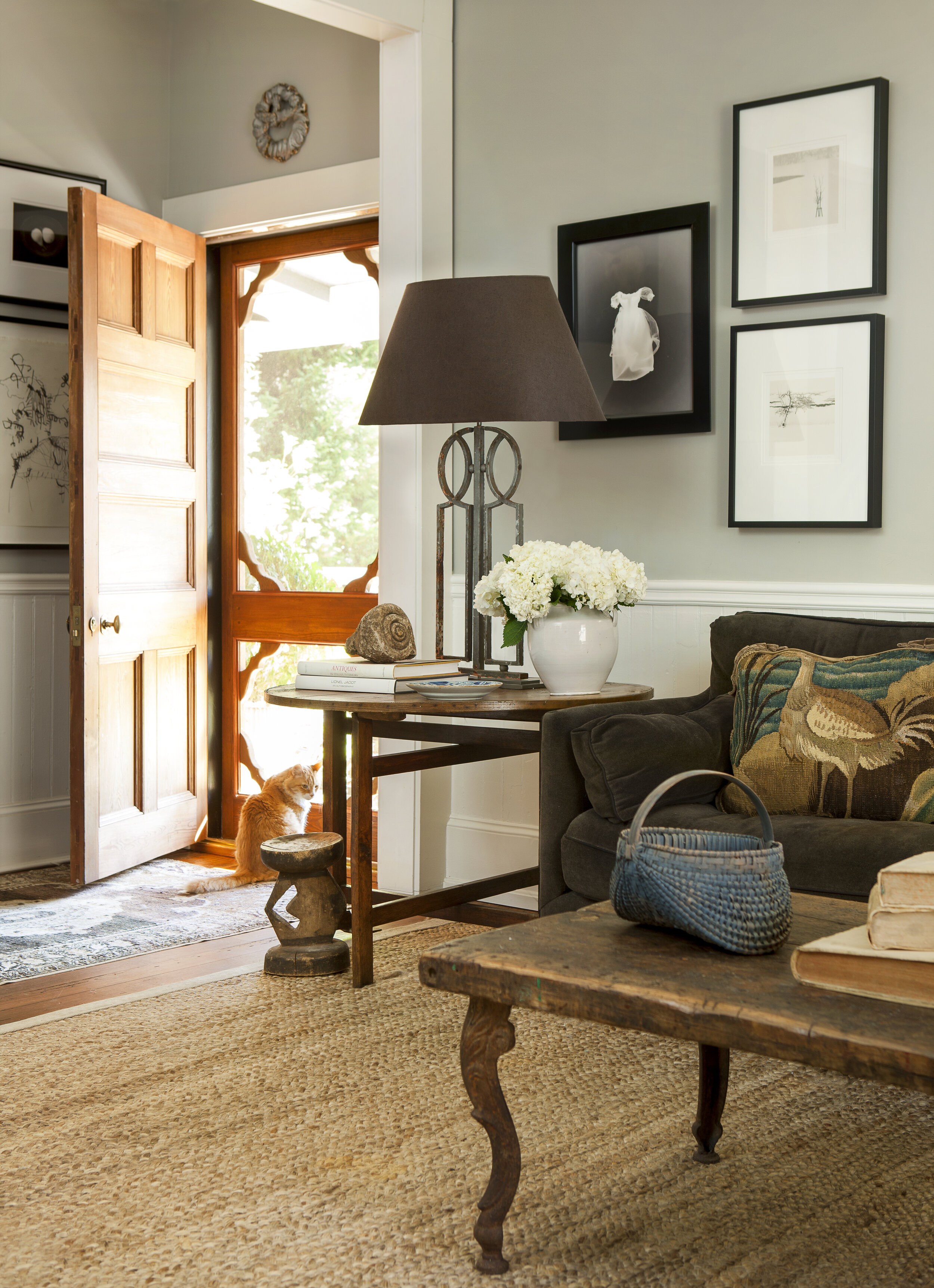
Todd murphy (right of door) dress, Michael Kenna, (bottom) Berries and falling snow, furano, hokkaido, japan, 2004. (top) single tree, furano, hokkaido, japan, 2004.
Is it ok to decorate with family photos?
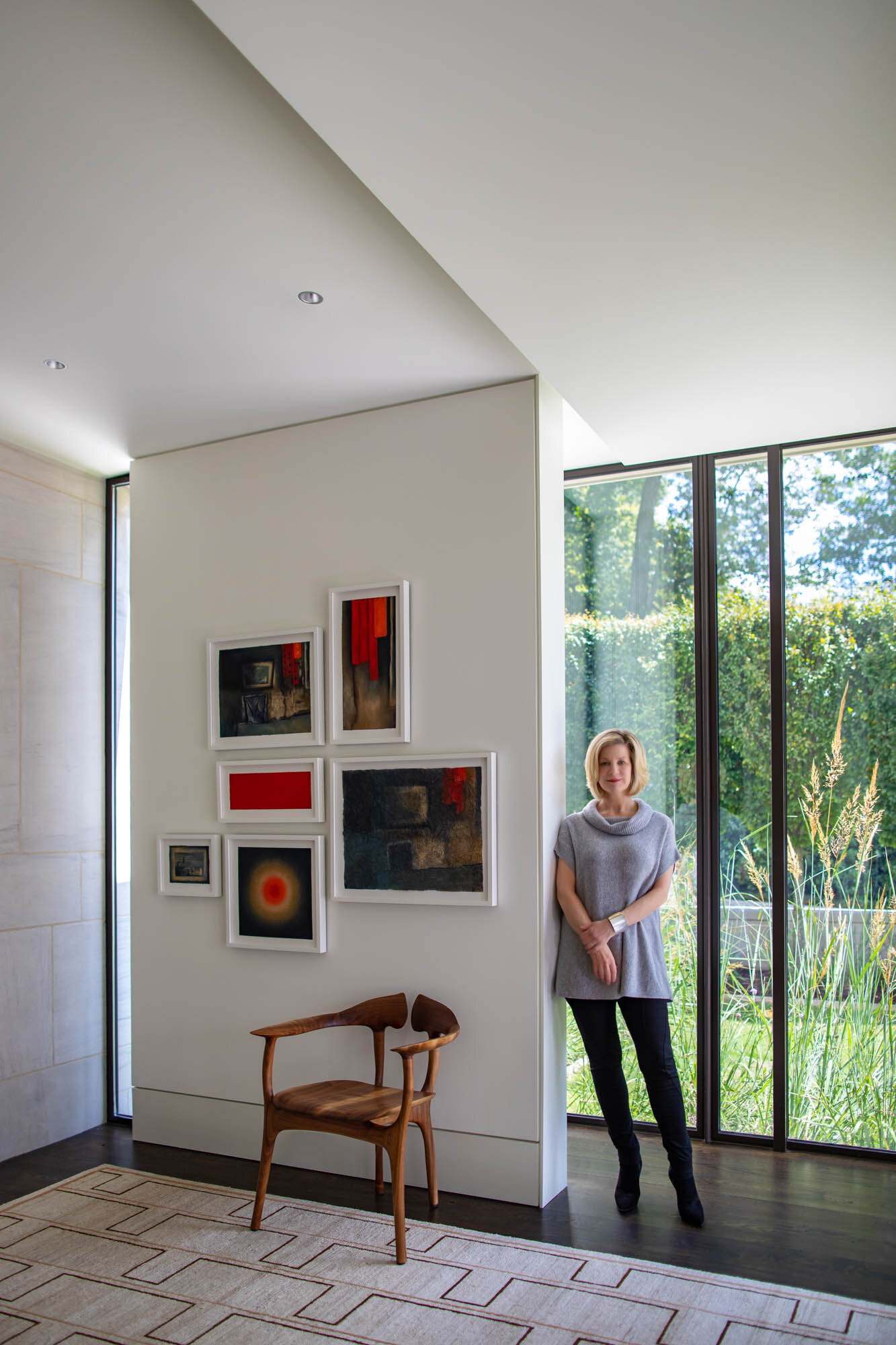
AWS: It is important to have family photos in your home. I am a bit of a traditionalist in that I like family photos in frames exhibited in bookshelves, side tables, dressers, etc. However, I am not a huge fan of the large scale family portraits on public walls in the home. The perfect place to have family photos are in hallways, private bedrooms, etc. The problem is that the family (ages of the children) changes so quickly, and I have found clients challenged as to what to do with older photos as the children grow up. My favorite way to display family photos is, if possible, dig out old family photos and mix them with current family photos on a hall wall. It is important to celebrate and honor your family in this way.
Sally Mann “Tobacco spit, 1987”, Gelatin silver print, 8” x 10” edition of 25, ©Sally Mann & courtesy gasosian.
BW: Of course. Being surrounded by family and your most favorite moments is always nice. Like Anna, I prefer these images to be a bit smaller and more intimate feeling and arranged thoughtfully on bookshelves and side tables. I would suggest that the photos look nicer than messy snapshots (keep those on your iPhone) and that the frame style is similar, so there is a thread tying them together, which makes it all feel like a thoughtful and visually organized collection.

Do you have a preference - black and white or color? Why?
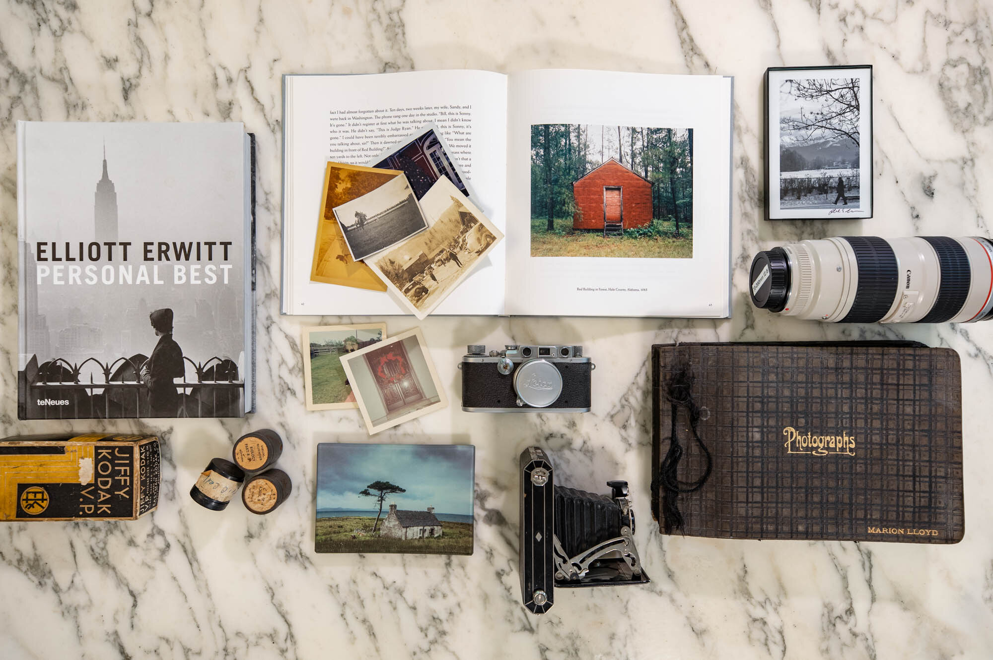
AWS: Although I greatly appreciate the practice and visual beauty of the large format color prints of the last 20 years both digital and analog, I have a personal affinity to 8 x 10 silver gelatin contact prints. I find that I am drawn to the depth and intimacy of silver gelatin photographs. For some reason, they ground me.

HENRI CARTIER-BRESSON, RUE MOUFFETARD, 1954. CLIENT’S OWN COLLECTION.
BW: I might’ve once said black and white, but I now love both! There is a liveliness and personality that color photographs bring to a room, but black and whites will always be stylish. Too hard to choose!

WHITNEY OTT, large format commissioned flower prints, 2016.
Which comes first: the size of the room or a photograph to hang in a room?
AWS: I have to say the photo comes first, and Barbara will say the room comes first, and she is probably right. Without a room, we cannot hang the photo. With that said, I feel that the photograph and the room both work together collaboratively. There are times when a client has a wonderful photograph and I have to give my honest opinion that it does not work in the room. However, the beauty of the space and the image is complete magic when it works, and many times it is not intentional, meaning the art is purchased then we find the best space.

Jeff Whetstone, (LEFT) QUEEN OF THE MEADOW. (RIGHT) CREEK CREEPER, sovereign buckhead. COPYRIGHT OF THE ARTIST AND COURTESY OF JACKSON FINE ART.
BW: Since most modern artists will print different sized editions of their work, I’d say the wall comes first (love that Anna knows how I think!) and then we’ll decide on the photograph and the scale of the image. However, vintage photography might only be available in one (usually smaller) size. If you love it, buy it, and you’ll find the right spot. Even if I have an exact spot in mind, I will walk around the house with a piece of art and hold it up to see where it looks best. Art and furniture are all mobile! I try not to always stick to the plan, but it’s always good to have one!

COURTNEY GARRETT, ARCHIVAL PIGMENT PRINT ON BIRCH WITH OIL PAINT AND RESIN.
If you could pick just one photograph to hang in your own home, which would it be, why, and where would you hang it?
AWS: I think about this question often. Because I am exposed to such an incredible collection of work every day, I fall in love frequently and fall out of love frequently. Today I would love to own a painted Saul Leiter nude, Helen Van Menne’s Butterfly girl, Erik Heck’s Milkmaid and Sally Mann’s Tobacco Spit. Lately, I have been also loving Norman Parkinson’s fashion works. But that is today. Tomorrow, it might be something new.

Hellen van Meene, Untitled #501, 2017. Chromogenic print. Courtesy of the artist and Yancey Richardson, New York.

Erik Madigan Heck, The Milkmaid 1, 2016. Courtesy of the artist and Jackson Fine Art
BW: Without a doubt, my favorite photograph is Elliott Erwitt’s “New York City (Woman with Empire State Building),” 1955. I purchased that print from Anna years ago because it reminds me so much of my mother. It’s a beautiful, serene image and every time I pass by it, I think of her.

Elliott Erwitt, (Right of armoire) New York City (Woman with Empire State Building), 1955.
It seems like fine art photography is more accepted now in the internet age than ever before. We can all capture every moment of our lives with our phones. How do you see the future of photography evolving?
AWS: The gallery is over 30 years old and given that history, we have watched the transformation of the medium. Technology has simply enhanced and strengthened the already dynamic medium. Artists/photographers are more inspired now more than ever given platforms on social media for exposure. However, I have seen many artists going back to older processes which I embrace. It is interesting how the trends change and go forward and backward and forward again. With Covid, we have been able to continue exhibitions with online viewing rooms. The greatest advantage of a viewing rooms (online exhibition room) is the ability to tell the artist’s story, to gain a wider audience and to curate exhibitions more frequently not to mention managing the high expense of mounting an in-house show. Today, photography has become one of the most expensive mediums to produce when you include scanning, print cost, mounting, etc.


~ W ~