


New Zealand:
Before & After
Story by Heather MacIsaac | Photos by Kevin Emirali
What is it about before and after pictures? Even the most sophisticated and well-realized project captures a more visceral response when beautiful post-completion photography is salted with pictures recording where the whole endeavor began.
It’s not just witnessing the distance a project has traveled. Before and after photos are seductive because they’re so hugely informative. Seeing changes side by side — mini-chapters in a primer of what to do and what not to do — is clarifying. And encouraging because it equips you with knowledge and inspiration.

Barbara Westbrook’s recent project in New Zealand is a perfect candidate for delivering, in before and after pictures, ten lessons in design and decoration. The house’s original sensibility — robust in scale, muscular in its use of materials, noisy in its cacophony of ideas, primal in spirit — could not swing further away from Barbara’s own. She took what the client described as “Aspen on steroids” and essentially turned the amplification down. Now the house is, as are all of her projects, a refined and highly livable home, a calm and interesting environment that reflects and embraces the natural beauty that is New Zealand’s greatest asset.
Lesson One:
Respect the Setting
When the landscape is as dramatic as that surrounding this house, allow it to take center stage. On the terrace, Barbara used sage green to unite clapboard and stucco sections of the exterior walls and installed all teak furniture. By shifting the palette from black and white to softer more natural colors, she transformed the space from a busy outdoor living room to a quiet platform for taking in the brilliant green sweep of land around the house.

BEFORE

AFTER
Lesson Two:
Eliminate the Superfluous
This house was constructed by a builder who, in hopes of improving the flavor, threw everything into the stew. Among several Jolly Green Giant touches was a built-in shelf unit rising all the way to the very high ceiling. Inaccessible shelves are never a good idea; here they were also a distraction. In paving over them, Barbara provided a cleaner wall for art and again, directed the view to the outside.


~ Click the Image Above to See the Before ~
Lesson Three:
Tread Lightly with Overt Associations
For Barbara, there was never any question that nature should thread its way through the house. But the original stacked stone fireplace with its thick beam of a mantel was oppressive and simply too dominant. With its new subtler surround of stone, the fireplace in the main living room offers up a link to nature without hammering it home. Natural and modern need not be mutually exclusive.


~ Click the Image Above to See the Before ~
Lesson Four:
Treat a big room as a composite of more intimate spaces
Leather upholstered sofas would seem to be an appropriate choice for the big living room of an indoor/outdoor house but their poor configuration at the center of the room, along with their deep color and big scale, weighed it down. With two wool kilims of the same size and complementary geometric patterns, Barbara established two seating areas within the living room and then lightened the space by choosing pale fabrics for new upholstered sofas and chairs and a light linen wrap for one of the large coffee tables.

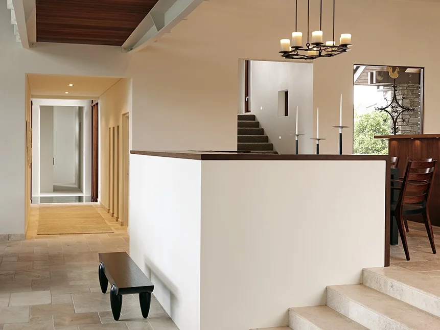
Lesson Five:
Clear the clutter
Objects are not the only things responsible for clutter; architectural devices like niches can add to it, too. With a clean sweep that brushed away shallow niches as well as a taller shelving unit, each displaying numerous ceramic pieces, Barbara brought visual relief to a too-busy passageway between the main living room and the kitchen that overlooks it.

~ Click the Image Above to See the Before ~
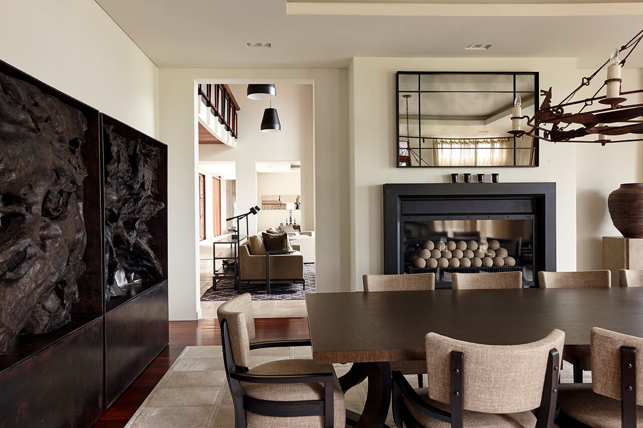
Lesson Six:
Ease the flow
Not every doorway needs a door. Floor to ceiling doors between the main living room and the dining room discouraged graceful movement between the two rooms and acted as a visual barrier. Removing the doors as well as the heavy stone chimney breast brightened and united the rooms.

~ Click the Image Above to See the Before ~
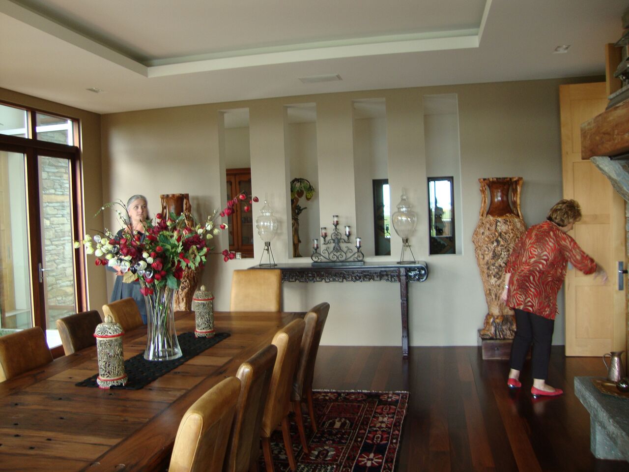
Lesson Seven:
Leave well-enough alone
Even though the dining room already featured a fireplace and two walls of windows offering dramatic vistas, the original builder couldn’t resist adding a stepped ceiling and piercing the only uninterrupted wall with four oversized slots. By restoring the wall to a single plane, Barbara not only provided the room with a place for a magnificent piece of art, The Seguin Triptych by Jerome Abel Seguin, she provided diners with a setting more palatable in every regard.

~ Click the Image Above to See the Before ~


Lesson Eight:
Make comfort a priority
A modern house in particular runs the risk of being too minimally furnished.
Adding curtains, a rug, generous club chairs, and easy to reach drinks tables turned a secondary living room into a much more hospitable space. The coffee table, an ironbound traveler’s trunk from the late 19th century Barbara found in Auckland, perfectly bridges the rustic and the refined.
Each bedroom gained curtains, better bedside lighting and a bedframe with an upholstered headboard, the ultimate in cocooning.


~ Click the Image Above to See the Before ~

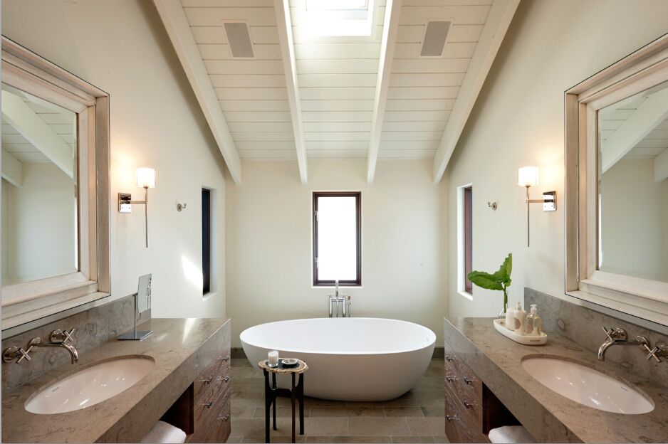
Lesson Nine:
Soften the structure
Certain amenities, like a jetted tub frozen in a black granite built-in, smack of another time. Not only did replacing it with a free-standing, egg-shaped tub update the master bathroom, it introduced a soft, organic shape that relates better to the natural setting it overlooks.
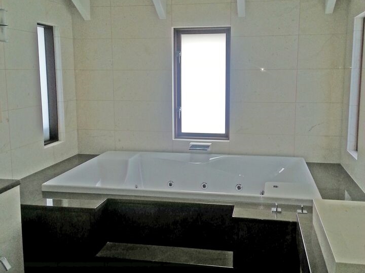
~ Click the Image Above to See the Before ~
Lesson Ten:
Remember what you came for
Where once the upstairs study turned its back on the view to unending greenery, now it invites it in. Before, an L-shaped sectional made the television the focal point of the room. Now, comfortable club chairs with ottomans and a day bed near the window are all positioned to take advantage of the very setting that lured the owners into purchasing the house in the first place.


~ Click the Image Above to See the Before ~
~ W ~


